3.11.2023 - 6.11.2023 (Week 6 - Week 7)
Gloria Khaw Ping Sim / 0359142 / Bachelor in Design (Honours) in Creative Media
Typography / Taylor's Lakeside University
Task 2
LECTURES
Please refer to Task 1 E-portfolio
INSTRUCTIONS
<iframe src="https://drive.google.com/file/d/1XxFBPWPl7q-eeWqlCV2lIs2WjEur5iSJ/preview" width="640" height="480" allow="autoplay"></iframe>
Task 2 : Text formatting and expression
SKETCHES
Fig 1.1. Sketches, Week 5 (27/10/2023)
DIGITALIZATION
Titles
Fig 2.1. Title Layout #1, Week 6 (30/10/2023)
For this, I wanted to emphasize on the word 'Code'.
Fig 2.2. Title Layout #2, Week 6 (30/10/2023)
For the second layout, I wanted to emphasize on the word 'Build'.
Fig 2.3. Title Layout #3, Week 6 (30/10/2023)
The third layout is similar to the first one, but arranged in a more horizontal way.
Fig 2.4. Title Layout #4, Week 6 (30/10/2023)
The fourth layout is also similar to #1 and #3. However, this one puts more emphasis on 'code'. In the third one, 'code' did not stand out as much.
Fig 2.5. Title Layout #5, Week 6 (30/10/2023)
This one is a shortened version of the second layout.
Layouts
Fig 3.1. Layout #1, Week 6 (30/10/2023)
Fig 3.2. Layout #2, Week 6 (30/10/2023)
For this layout, the body text looked too awkward and randomly placed. There was too much negative space.
Fig 3.3. Layout #3. Week 6 (30/10/2023)
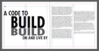
This also had too much negative space at the title.
Fig 3.4. Layout #4, Week 6 (30/10/2023)
Final Text Formatting and Expression
<iframe src="https://drive.google.com/file/d/1mhR3GzCn_-dgivH-QuX_YKST8R6yasw1/preview" width="640" height="480" allow="autoplay"></iframe>
Fig 4.2. Final Submission no grids - PDF, Week 7 (6/11/2023)
Fig 4.3. Final Submission with grids - JPEG, Week 7 (6/11/2023)
<iframe src="https://drive.google.com/file/d/1HskDF3EgCqa2j_EcJka9mrherNwbxfEL/preview" width="640" height="480" allow="autoplay"></iframe>
Fig 4.4. Final Submission with grids - PDF, Week 7 (6/11/2023)
FEEDBACK
Week 6
General Feedback :
General Feedback :
- The headline has to be meaningful and expressive
Specific Feedback :
- Negative space is not your enemy
Week 7
General Feedback :
General Feedback :
- Body text has to be consistent
- Need to be able to convey the message with the title. It should not be misleading
REFLECTIONS
Experience
Through this task, I have learnt how to properly create a layout and the rules of creating one. This task was slightly tough for me and I struggled a lot to find a layout I like. It was also hard to pick a topic I felt comfortable with.
Observation
In the topic I chose, I could focus on either the word 'build' or 'code', which gave me quite a lot of ideas. This topic also did not really require any other elements other than the text itself to convey a message. I also observed that every element in a layout needs to align with each other to make it more stable.
Findings
I found that making layouts is a hard process. I also found that making eye-catching title designs is harder than I expected.
FURTHER READING
I read a page that focused on alignment (page 98). I have learnt that the use of optical adjustments - which means aligning elements based on how the eyes visually perceives it - is necessary for visual clarity.


Comments
Post a Comment